Data Science · Data Science Core
Charts as evidence
In Data Science because a chart is a claim drawn from rows — bar, line, or scatter — not a Tableau or Power BI product lesson.
A chart is not decoration. The monthly-versus-drop-in spend bar is the sentence 'monthly members spent Rs 1380, drop-ins Rs 380' drawn large enough to see. This lesson picks a chart that matches the claim, using Rao's week — not a dashboard product tour.
- Data Science
- Medium level
- 5 concepts
1A chart is a sentence
If you cannot say the sentence, you cannot pick the chart. Stay with Rao's week. 'Monthly members spent more this week' is a comparison of two groups — monthly Rs 1380 versus drop-in Rs 380 — and that sentence wants a bar. 'Till rose toward the weekend' is one number lined up on days — 400, 420, 380, 450, 900, 1100, 800 — and that sentence wants a line. 'People who visit more also spend more' is two numbers on the same person — Anu is 4 visits and Rs 320 — and that sentence wants a scatter.
A dashboard with every chart at once is not evidence. One claim, one chart, with the numbers from the same sheet. This course is not a Tableau or Power BI product lesson. The table is the source.
No diagram — the matching of claim to chart sits in the table.
| claim | chart |
|---|---|
| Monthly spent 1380, drop-in 380 | bar — two groups |
| Till by day of week | line — value over dates |
| Visits versus spent for each person | scatter — two numbers on one row |
You want to show that monthly members spent more than drop-ins this week. Which chart matches the claim?
- A bar of spend by plan
- A scatter of name length versus plan
- A neural-net architecture diagram
Two groups, one number each — a bar.
2Bars compare groups
A bar chart gives each group a height. For Rao's plan split, monthly is 1380 tall and drop-in is 380 tall. Those heights are the same two totals you added from the names. The picture lets a reader see the comparison without subtracting in their head.
The heights must be the numbers from the split. A taller monthly bar that is only 'for impact' is a lie. 1380 / 380 is 3.63, so the monthly bar is a little more than three and a half times the drop-in bar — not twice as tall, not the same height with a louder colour.
Figure. Heights are the plan-split totals: monthly Rs 1380, drop-in Rs 380. The monthly bar is 1380/380 = 3.63 times the drop-in bar — not a decorative stretch.
How much taller is the monthly bar?
Monthly spend is Rs 1380 and drop-in spend is Rs 380. What is the ratio of the bar heights?
- 1380 / 3803.631...
- rounded to two decimals3.63
Pro tip. If a slide draws monthly only twice as tall, the picture no longer matches the table.
Coding lab. Heights a bar can use runs in the app, with checks on your output.
A slide draws monthly spend twice as tall as drop-in, but the table says 1380 vs 380. What failed?
- The bar heights no longer match the group-by numbers
- The sheet needs a train/test split
- Drop-in must be deleted
A chart is evidence only when its geometry is the table.
3A line is a value over dates
A line chart is for a value that already has an order — usually dates. Rao also keeps the till: the rupees in the drawer at the end of each day. Week 1, Monday through Sunday, is 400, 420, 380, 450, 900, 1100, 800. Saturday is the peak. Friday through Sunday hold 900 + 1100 + 800 = 2800 of the week's 4450. The line (or an ordered bar of those seven days) is that sequence, not a fitted curve and not a rent model.
You cannot shuffle those seven numbers by size and keep the same chart. Wednesday's 380 sits between Tuesday and Thursday because Wednesday is between Tuesday and Thursday, not because 380 is a typical ticket.
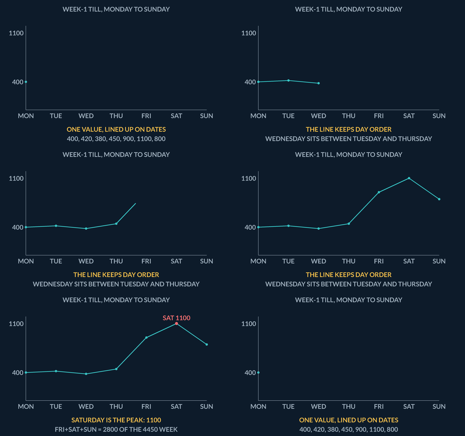
| day | till |
|---|---|
| Mon | 400 |
| Tue | 420 |
| Wed | 380 |
| Thu | 450 |
| Fri | 900 |
| Sat | 1100 |
| Sun | 800 |
Weekend-end of week 1
Friday 900, Saturday 1100, Sunday 800. Week 1 totals Rs 4450. How much of the week sits in those three days?
- 900 + 11002000
- 2000 + 8002800
- 2800 of 4450the late-week pile
Pro tip. The line is the seven numbers in day order. Saturday is the peak because 1100 is the largest of those seven, not because a model said so.
Coding lab. Draw the till in day order runs in the app, with checks on your output.
Till by day of week wants which chart?
- A line (or a bar of the ordered days)
- A scatter of plan versus name
- A confusion matrix
Dates already have an order. The seven till numbers are that sequence.
4A scatter is two numbers on one row
A scatter puts two numbers from the same row on one point. Stay with the eight customers. Anu is 4 visits and Rs 320, so her point is (4, 320). Chitra is (6, 510). Deepak is (0, 0) — zero visits and zero rupees. If you say the series includes every customer, Deepak's point has to be drawn. Leaving him off to 'keep the plot pretty' is the same lie as dropping his row from a mean.
The picture is still the sheet, not a fitted line. People who visit more often sit farther right; people who spend more sit higher. You can see whether the points climb together. You have not predicted spent from visits. That prediction is Machine Learning.
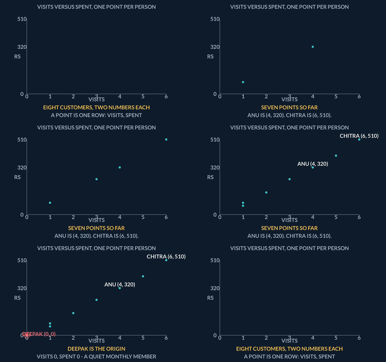
| name | visits | spent | point |
|---|---|---|---|
| Deepak | 0 | 0 | (0, 0) — must be drawn |
| Anu | 4 | 320 | (4, 320) |
| Chitra | 6 | 510 | (6, 510) |
Deepak is the origin
Deepak has visits 0 and spent 0. Anu has visits 4 and spent 320. If the scatter claims to include every customer, which points must be in the series?
- Deepak(0, 0) — origin
- Anu(4, 320)
- series that omits (0, 0)not every customer
Pro tip. A series that includes the origin must contain that point. Pretty is not a reason to drop Deepak.
Coding lab. Plot Deepak at the origin runs in the app, with checks on your output.
You want to show that people who visit more also spend more, using one point per customer. Which chart?
- A scatter of visits versus spent
- A bar of plan names
- A pie of the word yes
Two numbers on the same row — scatter. Deepak is (0, 0).
5Lab: bar of spend by plan
Print the two group totals so a later bar can use them as heights. groupby('plan')['spent'].sum() is the same plan split as the exploratory lesson: monthly 1380, drop-in 380. The check looks for 380 — the shorter bar — as well as the monthly 1380 you already printed there.
A bar is only evidence if its heights are these totals. This lab does not need a charting library. Printing the numbers is the honest first move. Geometry follows the split, not the other way around.
No diagram — the bar heights are printed by the coding lab.
| Step | Why |
|---|---|
| Sum spent by plan | Those two numbers are the bar heights |
| Look for 380 | Drop-in spend — the shorter bar |
| Do not stretch the picture | 1380 / 380 is 3.63, not 2 |
Coding lab. Totals a bar can draw runs in the app, with checks on your output.
Why print 1380 and 380 before drawing the bar?
- The bar heights must be those totals or the picture is not the table
- Printing trains sklearn
- 380 is a hyperparameter
Geometry follows the group-by, not the other way around.
Notes
- In Data Science because a chart is a claim drawn from rows — bar, line, or scatter — not a Tableau or Power BI product lesson.
- If you cannot say the sentence, you cannot pick the chart. 'Monthly members spent more this week' is a comparison of two groups — that is a bar.
- A bar chart gives each group a height. Monthly 1380 and drop-in 380 make the comparison visible without asking the reader to subtract in their head.
Exam traps & shortcuts
- Name the question before you open the sheet — a table without a question is just a dump.
- A number is a claim only when you can point at the rows that produced it.
Recap
Pick the chart that matches the claim: bars for groups, a line for dates, a scatter for two numbers on the same person.
- A chart is a sentence
- Say the claim first. Two groups want a bar. A value over dates wants a line. Two numbers on the same person want a scatter.
- Bars compare groups
- Monthly 1380 and drop-in 380 are the bar heights. 1380 / 380 is 3.63 — if a slide draws monthly only twice as tall, the picture is not the table.
- A line is a value over dates
- Rao's till Mon–Sun is 400, 420, 380, 450, 900, 1100, 800. Saturday is the peak. The line is that sequence, not a fitted curve.
- A scatter is two numbers on one row
- Anu is (4 visits, Rs 320). Deepak is (0, 0) and must be drawn if you say every customer is on the plot.
Practise Charts as evidence
Reading is free and needs no account. Practice, mocks and progress live in the app.
- A 3-question practice set that ends the chapter
- 5 quick checks with worked explanations
- Timed mocks scored with the real marking scheme
- Readiness tracked per topic, kept on your device