Machine Learning · Machine Learning Core
PCA
Principal components compress and plot high-dimensional tables by ranking orthogonal directions of variance — not labels.
Wide tables are hard to see. This lesson teaches principal components: orthogonal directions ordered by variance, used to compress columns or plot high-dimensional rows in 2D — then you fit PCA and scatter the projection in the browser.
- Machine Learning
- Medium level
- 5 concepts
- 10 practice questions
1A table too wide to see
Imagine you wear a fitness tracker for 400 days, and every day it records 20 different numbers: steps walked, calories burned, hours slept, resting heart rate, active minutes, and fifteen more. Written down, that is a table with 400 rows (one row per day) and 20 columns (one column per measurement). Now you want to actually look at your year — do workout days form a cluster? Are there odd days that sit far from the rest? Here is the problem: a chart on a screen has two axes, an x-axis and a y-axis, so you can plot two columns at a time. You cannot plot twenty. The table is simply too wide to see.
But notice something about those 20 columns: they do not move independently. On a heavy-workout day, steps go up, active minutes go up, and calories burned go up — all together, in one coordinated swing. On a lazy day they all sink together. So even though the table has 20 columns, the number of genuinely different stories it tells is much smaller — maybe two or three. Principal Component Analysis, or PCA, is the tool that finds those underlying stories automatically. That is the whole idea: PCA hunts for the few combined directions along which your rows actually differ, so you can keep those and drop the rest.
Figure. The tracker year is a 400-row, 20-column table, but a chart on a screen offers only two axes. Because the columns rise and fall together, the days genuinely differ along only two or three combined directions - and PCA is the tool that finds those automatically so you can keep them and drop the rest.
Two columns, one story: four tracker days by hand
Take four days from the tracker year and just two of its 20 columns — steps walked, in thousands, and active minutes. Day 1: 2 thousand steps, 20 active minutes. Day 2: 12 and 40. Day 3: 4 and 24. Day 4: 10 and 36. The claim to test is the heart of the idea above: these two columns do not tell two separate stories. Work out each day's swing — how far it sits above or below the column's own average — for both columns, then check whether a single number per day can stand in for both columns at once.
- Steps average: (2 + 12 + 4 + 10) ÷ 4 = 28 ÷ 47 thousand
- Steps swings, day by day: 2 − 7, 12 − 7, 4 − 7, 10 − 7[−5, +5, −3, +3]
- Active-minutes average: (20 + 40 + 24 + 36) ÷ 4 = 120 ÷ 430 minutes
- Active-minutes swings: 20 − 30, 40 − 30, 24 − 30, 36 − 30[−10, +10, −6, +6]
- Compare the swing lists: −10 is 2 × (−5), +10 is 2 × (+5), −6 is 2 × (−3), +6 is 2 × (+3) — every day's minutes swing is exactly twice its steps swingthe two columns move as one
- So one number per day — call it d, the day's steps swing — rebuilds both columns: steps = 7 + d, minutes = 30 + 2 × d. Check day 2 with d = +5: 7 + 5 and 30 + 1012 and 40 — both columns recovered
Pro tip. Real columns never move in perfect lockstep — one rainy treadmill day would break the exact factor of 2 — so a real 20-column table cannot be rebuilt perfectly from 2 or 3 numbers per day. PCA's job is to find the best shared swings anyway and to report honestly how much of the day-to-day difference they keep. This perfect toy is the limiting case that shows what 'the columns swing together' actually means.
What is the primary objective of Principal Component Analysis (PCA)?
- To train a non-linear neural network that predicts binary class labels
- To project high-dimensional data onto orthogonal directions that capture the greatest variance
- To partition observations into k mutually exclusive geometric clusters
- To impute missing values by training iterative regression trees
PCA finds orthogonal directions (principal components) along which the data varies the most, allowing dimensionality reduction with minimal information loss.
2Two words: component and variance
Two words in that sentence need grounding before anything else. A direction (PCA calls it a component) is a recipe that blends all 20 columns into one new score — something like 0.4 \times \text{steps} + 0.3 \times \text{active minutes} + 0.2 \times \text{calories} + \dots, giving each day a single number. In the tracker story, that first recipe would read roughly as "how big a workout day was this?" — one column that summarises many. And variance is just the statistician's word for spread: how far the numbers sit from their average. A column where every day is nearly identical has low variance; a column where days differ wildly has high variance. So "the direction with the most variance" means: the blend of columns along which your 400 days differ from each other the most.
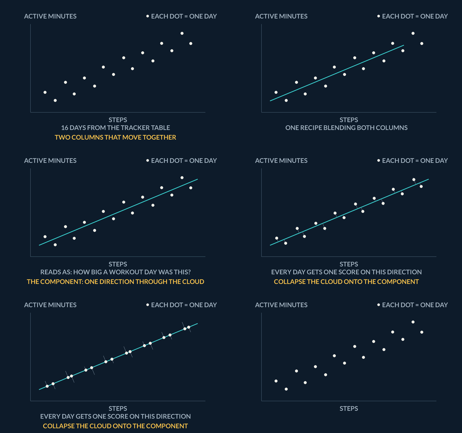
| Word | In plain terms |
|---|---|
| Direction (component) | A recipe blending all 20 columns into one new score per day |
| Variance | Spread: how far the numbers sit from their average |
| Direction with most variance | The blend along which the 400 days differ from each other the most |
Why must feature columns be mean-centred before computing principal components?
- To ensure that all singular values equal exactly 1.0 in magnitude
- To convert categorical string features into continuous floating-point vectors
- So the principal component axes pass through the centroid of the data cloud rather than being skewed by the origin
- To guarantee that the explained variance ratio reaches 100% on the first component
Centering by subtracting feature means ensures the first principal component aligns with the direction of maximal variance through the center of the data, rather than pointing toward the origin.
3Ranked directions you can add up
PCA hands you its components in a strict order. The first principal component, written PC1, is the single direction that captures the most spread in the data. PC2 is the direction with the next-most spread, chosen at right angles to PC1 — the technical word is orthogonal, and it matters because a right-angle direction cannot repeat any of the spread PC1 already captured. Each component carries genuinely new information, with no double-counting. PCA also tells you how much each component captured, as a fraction called the explained variance ratio: if PC1 reports 0.62, it alone holds 62% of all the spread in your 20 columns, and because components never double-count, you may simply add the fractions — PC1 and PC2 at 0.62 + 0.28 = 0.90 means two numbers per day preserve 90% of how your days varied.
That ordering is exactly what makes PCA useful, in two ways. First, plotting: give every day its PC1 score as the x-coordinate and its PC2 score as the y-coordinate, and suddenly your unplottable 20-column year is a 2D scatter — each dot one day, days that lived similarly sitting near each other. Second, compression: instead of feeding all 20 columns into some later model, keep just the top few component scores. Fewer columns, most of the spread retained.
Figure. Each component reports the fraction of total spread it captured. Because components are orthogonal and never double-count, the fractions add: PC1 at 0.62 plus PC2 at 0.28 means two numbers per day preserve 90% of how the days varied, leaving 0.10 to all the later components combined.
- Scale the columnsStandardise features so one large unit does not dominate the variance directions.
- Fit on train onlyLearn components from X_train; transform test with the same rotation — never refit on test.
- Keep enough varianceChoose the number of components by cumulative explained variance, not by eye on a scatter alone.
| Piece | What it is | In the tracker year |
|---|---|---|
| PC1 | The single direction capturing the most spread | Each day's x-coordinate; at 0.62 it alone holds 62% of the spread in 20 columns |
| PC2 | Next-most spread, at right angles to PC1 — cannot repeat what PC1 captured | Each day's y-coordinate; adds 0.28 of genuinely new spread |
| Explained variance ratio | Fraction of total spread each component captured; no double-counting, so fractions simply add | 0.62 + 0.28 = 0.90 — two numbers per day keep 90% of how the days varied |
| Keeping only top scores | Compression: feed a later model the top component scores instead of every column | Fewer columns than the original 20, most of the spread retained |
How many components keep 95%?
You run PCA on the full tracker table - 400 days, all 20 columns scaled - and it prints explained_variance_ratio_ = [0.62, 0.28, 0.04, 0.02, 0.01, ...]: one fraction per component, largest first, each fraction the share of the total spread that component captured, with the trailing components sharing the last 0.03 between them. A later model hates width, so you want as few component scores per day as possible while still keeping at least 95% of the spread. Walk the list, adding fractions until the running total crosses 0.95: how many components do you keep?
- Cumulative after PC10.62 - far short of 0.95
- 0.62 + 0.28 (add PC2)0.90 - still short
- 0.90 + 0.04 (add PC3)0.94 - still short
- 0.94 + 0.02 (add PC4)0.96 - crosses 0.95
- Component scores each day keeps4, down from 20 columns
Pro tip. The walk gets expensive fast: PC1 and PC2 bought 90% between them, the next two bought only 6 more - the fractions shrink as you go, so fix the target before you read the list. sklearn will do the walk for you: PCA(n_components=0.95) keeps exactly enough components to cross 95%.
How do the principal components returned by PCA relate to one another geometrically?
- They are parallel vectors with identical lengths and directions
- They form a non-linear curved manifold that wraps around the data points
- They are mutually orthogonal (perpendicular), ensuring zero correlation between the projected components
- They intersect at 45-degree angles to preserve class separation boundaries
Principal components are orthogonal eigenvectors of the covariance matrix, meaning each subsequent component captures variance uncorrelated with all preceding components.
4Spread is not signal
One warning, because it is the classic trap. PCA never looks at labels. If each day were tagged "felt great" or "felt tired", PCA would not know and would not care — it is unsupervised, meaning it works from the measurements alone. It ranks directions purely by spread, and spread is not the same thing as usefulness for prediction: a direction with tiny variance can still be exactly the axis that separates "felt great" from "felt tired" days, and dropping it because it looked small can quietly throw away the signal a classifier needed. PCA is a summariser, not a predictor. One practical corollary: because PCA chases variance and variance follows units, always scale your columns first — otherwise a column measured in big numbers (steps, in the thousands) would dominate every component while sleep hours (around 7) barely registered, purely because of units.
The picture below shows the whole idea shrunk to just two columns, so it fits on a page: each dot is one day, plotted by steps walked against calories burned (both scaled). The dots form a stretched, tilted cloud, because the two columns rise and fall together. The solid line through the cloud's long axis is PC1 — the direction of most spread. The short dashed line at right angles is PC2, holding what little spread remains. Keep only each day's position along PC1 and you have compressed two columns into one while losing the least information. With your real table, the same thing happens in 20 dimensions — you just cannot draw that, which is precisely why PCA is the tool that lets you see it.
Figure. Each dot is one day, plotted by steps walked against calories burned. The cloud is elongated because the two columns rise and fall together, so most of its spread lies along one direction: PC 1. The dashed PC 2, at right angles, carries what little variance is left. Keeping only the PC 1 coordinate compresses two columns into one while losing the least spread - that is the whole trade, and no class labels were consulted.
| Need | Reach for |
|---|---|
| Plot / compress many columns | PCA (scale first) |
| Predict a defined label | Supervised model + metrics — not PCA alone |
Variance follows units: steps vs sleep, before and after scaling
Four tracker days, two columns. Hours slept: 6, 8, 7, 7. Steps walked, counted in raw steps this time: 2,000, 12,000, 4,000, 10,000 — the same four days whose steps in thousands read 2, 12, 4, 10. Variance, the spread as one number, is the average of the squared gaps between a column's entries and that column's own average. Compute both columns' variances as the tracker records them, then re-measure steps in thousands and recompute, and see which direction PCA's 'most variance' rule would chase in each case.
- Sleep average: (6 + 8 + 7 + 7) ÷ 4 = 7; gaps from it: −1, +1, 0, 0squared gaps 1, 1, 0, 0
- Sleep variance — the average of those squared gaps: (1 + 1 + 0 + 0) ÷ 40.5
- Steps average: (2,000 + 12,000 + 4,000 + 10,000) ÷ 4 = 7,000; gaps: −5,000, +5,000, −3,000, +3,000squared gaps 25,000,000 twice and 9,000,000 twice
- Steps variance: (25,000,000 + 25,000,000 + 9,000,000 + 9,000,000) ÷ 4 = 68,000,000 ÷ 417,000,000
- Unscaled verdict: 17,000,000 ÷ 0.5 = 34,000,000 — the steps column carries 34 million times the sleep column's variance, so the first component would be the steps axis before any real structure is consultedPC1 by units alone
- Re-measure the same steps in thousands: gaps −5, +5, −3, +3; variance (25 + 25 + 9 + 9) ÷ 417
- Same four days, same behaviour, yet the variance fell from 17,000,000 to 17 — a million-fold drop from a unit change; standardising every column (each column's gaps divided by that column's own spread) sets every variance to exactly 1no column can win PC1 by units
Pro tip. Scaling removes the units artifact, not the deeper trap. After standardising, PCA still ranks directions purely by spread, and spread is still not signal: a direction can come out of scaling with tiny variance and still be the axis that separates 'felt great' days from 'felt tired' ones. Scale first, then still check what the components you dropped were carrying.
Before a supervised fit, you drop the lowest-variance principal components. Why can that quietly hurt the model?
- It cannot — less variance always means less information
- Variance is not predictive signal: a thin, low-variance direction can carry exactly the axis that separates the classes
- PCA components cannot be dropped once fitted
- Dropping components changes the labels
PCA orders directions by input spread, knowing nothing about y. A high-variance direction can be noise while a thin one carries the class-separating signal.
5Lab: PCA projection
Time to run PCA for real. Since you do not have 400 days of tracker data lying around, Cell 1 manufactures a stand-in: make_classification builds a synthetic table X with 400 rows and 20 numeric columns — same shape as the tracker year — plus an array called labels that tags each row with one of three classes (think of them as "rest day", "light day", "training day"). Keep in mind what each name holds: X is the wide table of measurements, and labels is the tag per row that PCA itself will never be shown.
Cell 1 then does two things in order, and the order matters. First, StandardScaler().fit_transform(X) rescales every column to the same footing — mean 0, spread 1 — producing X_scaled. This is the scale-first rule from the concept above: PCA ranks directions by variance, and variance follows units, so without this step whichever column happened to use the biggest numbers would win PC1 by default. Second, PCA(n_components=2) asks for exactly the top two components, and fit_transform hands back X_pca: still 400 rows, but now only 2 columns — each row's PC1 score and PC2 score. Twenty columns in, two out.
The line worth reading closely is the print of explained_variance_ratio_. It shows two fractions, one per kept component — say [0.31, 0.12]. The first means PC1 alone captured 31% of all the spread in the 20 scaled columns; the second means PC2 added another 12%. Add them and you know your 2D picture preserves 43% of how the rows varied — and, just as usefully, that 57% of the spread lives in the 18 directions you threw away. The notebook cells share one kernel, so X_pca and labels stay alive after Cell 1 finishes; Cell 2 does nothing but draw, scattering each row at its (PC1, PC2) coordinates and colouring each dot by its entry in labels.
Be precise about what that colour means, because this is where beginners over-read the plot. PCA was fitted on X_scaled only — it never saw labels. The colouring is applied afterwards, purely so your eye can check whether the classes happen to land in different regions. If they do, that is a pleasant discovery, not something PCA aimed for. And the reverse misreading matters too: a high explained variance ratio does not promise separated colours. The ratio measures how much of the input spread survived the compression — nothing about classes. Two components can keep 85% of the spread while the colours overlap completely, because the direction that distinguished the classes was one of the small ones PCA ranked low and you dropped.
So if your scatter looks like one undifferentiated blob, do not conclude the lab failed. It may mean the class structure lives in more than two directions, or in low-variance ones. You can try more informative features, keep more components, or simply accept the honest answer: two components did not carry the structure you cared about — which is itself something you now know about your data.
No diagram — the projection is drawn by the coding lab plot, not a static figure.
| Step | Why |
|---|---|
| StandardScaler before PCA | Variance is unit-sensitive; unscaled columns dominate |
| PCA(n_components=2) | Compress / plot wide X in the plane |
| Print explained_variance_ratio_ | See how much spread the two PCs keep |
| Scatter coloured by labels | Labels are for the eye only — PCA never saw them |
Coding lab. Scale, PCA to 2D, scatter runs in the app, with checks on your output.
The lab prints explained_variance_ratio_ of 0.85 for two components, yet the class colours overlap completely in the scatter. What does 0.85 describe?
- The accuracy a classifier would reach on the projection
- How much of the input spread the two components keep — nothing about class separation
- The share of rows plotted without overlap
- The correlation between the two components
The ratio is about reconstructing X, not predicting y. PCA never saw the labels; colour in the scatter is only a guide for the eye.
Notes
- PCA finds orthogonal directions (components) ordered by how much variance in the data they explain.
- Projecting onto the first two components is a common way to plot a high-dimensional table in 2D for exploration.
- PCA ranks directions by variance, not by predictive signal — scale features before fitting.
Exam traps & shortcuts
- Keep lab datasets under 2000 rows in the browser runtime.
- Scale features before PCA when columns live on different units.
Recap
This lesson in brief:
- PCA
- PCA finds orthogonal directions (components) ordered by how much variance in the data they explain.
- When to use it
- Reach for PCA to visualise sensors, embeddings, or wide tables — or to shrink columns before a supervised model that hates width.
Practise PCA
Reading is free and needs no account. Practice, mocks and progress live in the app.
- 10 exam-style questions on this topic, with explanations
- A 5-question practice set that ends the chapter
- Timed mocks scored with the real marking scheme
- Readiness tracked per topic, kept on your device