Machine Learning · Machine Learning Core
ROC and AUC
ROC plots true-positive rate against false-positive rate across thresholds; AUC summarises the ranking quality of a scorer.
After precision and recall at one cut, the next question is how the scorer ranks cases across every threshold. This lesson teaches the ROC curve, what AUC summarises, and lets you compute and plot both in the browser.
- Machine Learning
- Medium level
- 5 concepts
- 10 practice questions
1A score, a threshold, two rates
Picture a spam filter. For every incoming email it does not just shout "spam" or "not spam" — under the hood it produces a score between 0 and 1, something like 0.93 for an email full of suspicious links and 0.08 for a note from your mother. That score is the model's confidence that the email is spam. To turn a score into an actual decision, you pick a cutoff number called the threshold: every email scoring above the threshold gets labelled spam, every email below it gets through to the inbox. The threshold is a dial you are free to set anywhere — 0.9, 0.5, 0.2 — and every setting gives you a different filter.
Each setting of that dial makes two kinds of calls, and we track each with its own rate. The true-positive rate (TPR) asks: of all the emails that really are spam, what fraction did we catch? If 20 spam emails arrived and our threshold caught 16 of them, the TPR is 16/20 = 0.80. The false-positive rate (FPR) asks the opposite question about the innocent emails: of all the emails that are genuinely not spam, what fraction did we wrongly flag? If 80 legitimate emails arrived and 8 got dumped into the spam folder, the FPR is 8/80 = 0.10. So TPR is "share of real spam caught" — good, we want it high — and FPR is "share of innocent mail wrongly flagged" — bad, we want it low.
Figure. One threshold setting, scored on both kinds of mail: of the 20 real spam emails it caught 16, a true-positive rate of 16/20 = 0.80; of the 80 legitimate emails it wrongly flagged 8, a false-positive rate of 8/80 = 0.10. TPR is the share of real spam caught (want it high); FPR is the share of innocent mail flagged (want it low).
What two quantities are plotted on the axes of an ROC curve across varying classification thresholds?
- Precision on the y-axis versus Recall on the x-axis
- True Positive Rate (Recall) on the y-axis versus False Positive Rate on the x-axis
- Training loss on the y-axis versus Validation loss on the x-axis
- Accuracy on the y-axis versus Number of Trees on the x-axis
The ROC curve plots TPR = TP/(TP+FN) against FPR = FP/(FP+TN) across the full continuum of threshold cuts.
2The trade-off you cannot escape
Here is the catch: the two rates are chained together by the threshold. Set the threshold very high (strict) and you flag almost nothing — few innocent emails are wrongly flagged (low FPR, good) but you also miss most of the real spam (low TPR, bad). Set it very low (loose) and you flag almost everything — you catch nearly all the spam (high TPR, good) but you also bury half of your real mail (high FPR, bad). Loosening the threshold always moves both rates up together; tightening moves both down. You cannot improve one without paying in the other — you can only choose where on that trade-off to sit.
| Threshold setting | Real spam caught (TPR) | Innocent mail flagged (FPR) |
|---|---|---|
| Very high (strict) | Low — misses most of the real spam | Low — few innocent emails wrongly flagged |
| Very low (loose) | High — catches nearly all the spam | High — buries half of your real mail |
Turn the dial both ways and count what it costs
The same ten scored emails as everywhere in this lesson: the four real spam emails scored 0.92, 0.81, 0.68 and 0.35, and the six legitimate emails scored 0.74, 0.52, 0.40, 0.28, 0.15 and 0.06. The rule stays the rule: an email whose score is at or above the threshold gets flagged as spam. First set the dial very strict, at 0.90, and count both rates. Then swing it very loose, to 0.20, and count again. Finally, try to escape the trade-off in each direction: find the best true-positive rate any threshold can reach while flagging zero legitimate emails, and the smallest false-positive rate any threshold can reach while catching all four spam emails.
- Fix the denominators before touching the dial: 4 of the 10 emails are real spam and 6 are legitimateevery TPR divides by 4, every FPR by 6
- Strict setting, threshold 0.90 — only the score 0.92 clears it, and that email is real spam, so TP = 1 and FP = 0TPR = 1/4 = 0.25, FPR = 0/6 = 0.00
- Loose setting, threshold 0.20 — all four spam scores clear it, and so do the legitimate scores 0.74, 0.52, 0.40 and 0.28 (only 0.15 and 0.06 stay below), so TP = 4 and FP = 4TPR = 4/4 = 1.00, FPR = 4/6 \approx 0.67
- Price the swing email by email: spam caught went from 1 to 4, a gain of 3; innocent mail flagged went from 0 to 4, a cost of 4both rates rose together — the gain and the cost arrived as one package
- Escape attempt upward: zero false alarms means no legitimate score may clear, so the threshold must sit above 0.74, the top legitimate score — and then only the spam scores 0.92 and 0.81 clear itTPR caps at 2/4 = 0.50 with FPR held at 0.00
- Escape attempt downward: catching all four spam emails needs the threshold down at 0.35, which drags the legitimate scores 0.74, 0.52 and 0.40 over the line with themFPR is at least 3/6 = 0.50 once TPR reaches 1.00
Pro tip. The ceiling lives in the scores, not in the dial. No threshold gets this list to TPR 1.00 with FPR 0.00, because the legitimate email scoring 0.74 outranks two of the real spam emails — and no amount of dial-turning reorders scores. The threshold only picks a point off the menu; improving the menu itself takes a better scorer.
On an ROC curve, moving toward the top-right corner (1, 1) corresponds to which threshold strategy?
- Raising the threshold to classify almost every instance as negative
- Lowering the decision threshold to classify almost every instance as positive
- Setting the regularisation penalty parameter alpha to infinity
- Pruning the maximum depth of a random forest ensemble to one
At threshold -> 0, everything is called positive, so TPR = 1 and FPR = 1, corresponding to coordinate (1, 1).
3The curve of every choice
The ROC curve is simply a picture of every choice you could make. Take one threshold setting, measure its FPR and TPR, and plot that as a single point — FPR on the horizontal axis, TPR on the vertical axis. Now slide the threshold from strictest to loosest, plotting a point for each setting, and connect the dots. The line you get is the ROC curve (the name "receiver operating characteristic" is a leftover from 1940s radar engineering — nobody expects you to find it descriptive). Every point on the curve is one filter you could deploy; the whole curve is the menu of trade-offs your scorer offers.
How do you read that picture? Two landmarks. First, the dashed diagonal line from the bottom-left corner to the top-right is what pure guessing looks like: a "scorer" that assigns random scores catches spam at exactly the same rate it flags innocent mail, so its points fall on that line. Second, the top-left corner is perfection — catch 100% of spam (TPR = 1) while flagging 0% of innocent mail (FPR = 0). So the more your curve bows up and away from the diagonal toward that top-left corner, the better your scorer: at every level of false alarms, it is catching more of the real spam than a guesser would.
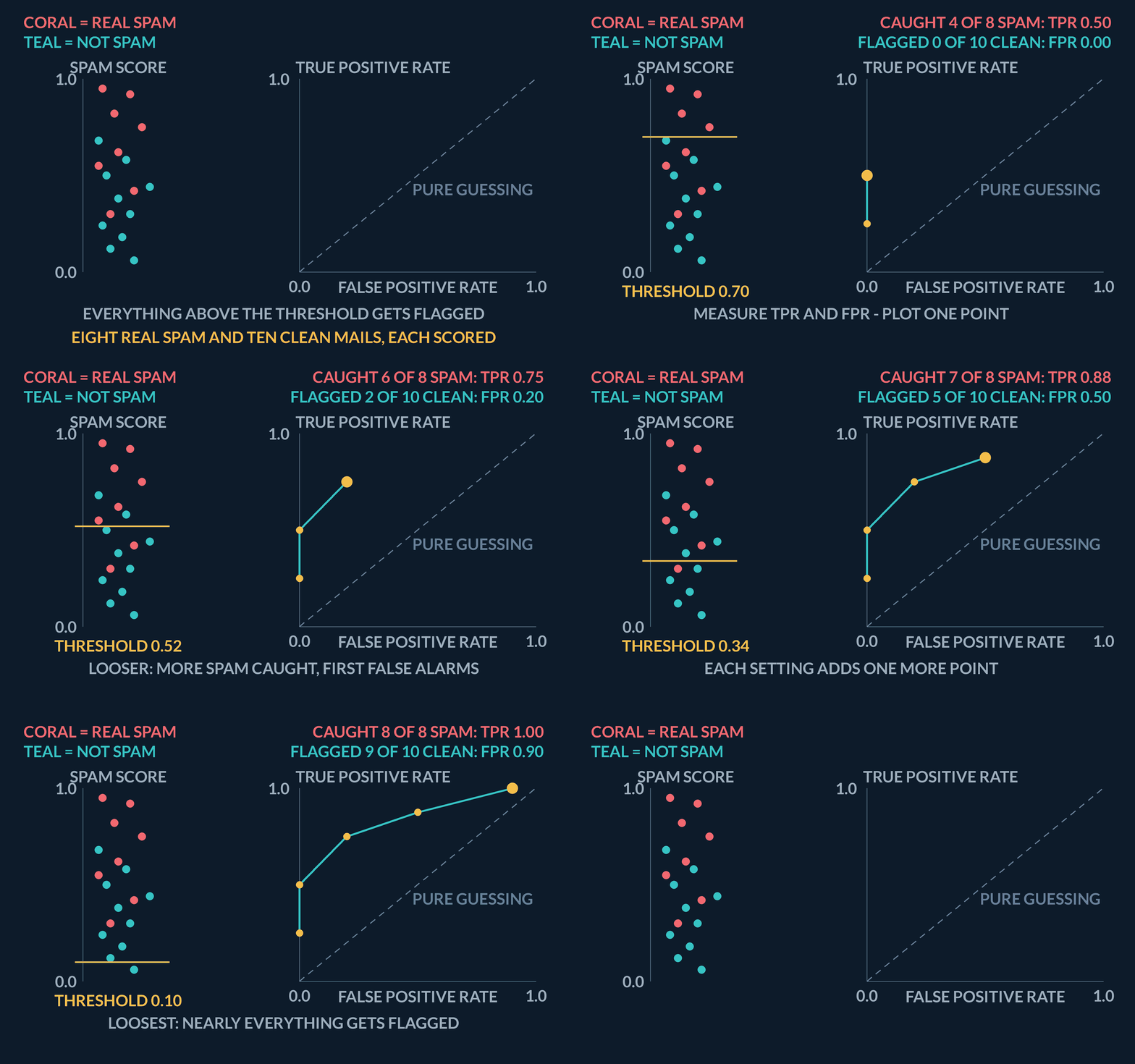
- Score, don't hard-labelROC needs continuous probabilities or scores — not a single 0/1 prediction.
- Sweep the thresholdPlot TPR vs FPR as you move the cutoff from strict to loose.
- Read AUCArea under the curve summarises ranking quality — 0.5 is random, 1.0 is perfect separation.
| Threshold | TPR (of 4 spam) | FPR (of 6 clean) | ROC point |
|---|---|---|---|
| 0.80 — strictest | 2/4 = 0.50 | 0/6 = 0.00 | (0.00, 0.50) |
| 0.50 | 3/4 = 0.75 | 2/6 \approx 0.33 | (0.33, 0.75) |
| 0.30 — loosest | 4/4 = 1.00 | 3/6 = 0.50 | (0.50, 1.00) |
Three thresholds, three ROC points, by hand
The same spam filter, on a sample small enough to check at your desk. Ten emails came in and each got a score. The four real spam emails scored 0.92, 0.81, 0.68 and 0.35. The six legitimate emails scored 0.74, 0.52, 0.40, 0.28, 0.15 and 0.06. The rule, as always: an email whose score is at or above the threshold gets flagged as spam. Compute the true-positive rate and the false-positive rate at thresholds 0.80, 0.50 and 0.30, and plot the three ROC points.
- Fix the denominators before touching any threshold: 4 of the 10 emails are real spam, 6 are legitimateevery TPR divides by 4, every FPR divides by 6
- Threshold 0.80 — scores at or above it: 0.92 and 0.81, both real spam, so TP = 2, FP = 0TPR = 2/4 = 0.50, FPR = 0/6 = 0.00 → point (0.00, 0.50)
- Threshold 0.50 — now 0.92, 0.81, 0.74, 0.68 and 0.52 clear it: three spam (0.92, 0.81, 0.68) plus two legitimate (0.74, 0.52), so TP = 3, FP = 2TPR = 3/4 = 0.75, FPR = 2/6 \approx 0.33 → point (0.33, 0.75)
- Threshold 0.30 — two more emails clear it: 0.40 (legitimate) and 0.35 (spam), so TP = 4, FP = 3TPR = 4/4 = 1.00, FPR = 3/6 = 0.50 → point (0.50, 1.00)
- Plot the three points, strictest threshold to loosest: (0.00, 0.50), then (0.33, 0.75), then (0.50, 1.00)each loosening moved the point right and up — more spam caught, more innocent mail flagged
- Check against the chance diagonal, where TPR equals FPR: 0.50 > 0.00, 0.75 > 0.33, 1.00 > 0.50all three points sit above the diagonal — this scorer beats guessing at every cut we tried
Pro tip. This little tally is exactly what sklearn's roc_curve does at scale: every distinct score in the test set is a candidate threshold, so ten emails can give only a handful of distinct points. The smooth-looking curve you plot in the lab is thousands of these staircase steps drawn close together.
What does an ROC curve following the diagonal line from (0, 0) to (1, 1) signify about the classifier?
- The model is a perfect classifier with zero error across all thresholds
- The dataset features are perfectly linearly separable in input space
- The model has no discriminative ability and performs identically to random coin flipping
- The model is severely overfitting the majority class observations
The diagonal line represents TPR = FPR at every cut, meaning the classifier cannot differentiate positive from negative cases better than random chance.
4AUC grades the ranking
AUC stands for area under the curve, and it is literally that: the amount of area trapped below the ROC curve, on a plot whose full square has area 1. A perfect scorer's curve hugs the top-left corner and encloses the whole square, so AUC = 1.0. A guessing scorer sits on the diagonal and encloses half the square, so AUC = 0.5. There is also a wonderfully concrete way to read the same number: pick one random spam email and one random legitimate email — AUC is the probability your scorer gives the spam one the higher score. AUC 0.85 means that in 85 out of 100 such pairings, the spam email outranks the innocent one. That makes AUC a grade for the ranking, judged across all thresholds at once, which is why it stays steady even when the mix of spam to real mail shifts — unlike accuracy, which is tied to one fixed cut.
One warning before you fall in love with the number. AUC tells you the menu of trade-offs is good; it does not pick your dish. A deployed filter runs at one specific threshold, and choosing it means weighing real costs — a missed spam email is an annoyance, but a real email lost to the spam folder might be a job offer. A model with a superb AUC and a carelessly chosen threshold can still make terrible calls. So always pair the AUC with a deliberately chosen operating point and a sentence about the costs behind it.
| Piece | Role |
|---|---|
| TPR (recall) | Share of real positives you catch |
| FPR | Share of real negatives you false-alarm |
| AUC | Area under the ROC — ranking quality in one number |
AUC as 24 duels, counted by hand
AUC has a plain reading: pick one random spam email and one random legitimate email, and AUC is the probability the scorer gives the spam one the higher score. On the lesson's ten emails — spam scored 0.92, 0.81, 0.68 and 0.35; legitimate scored 0.74, 0.52, 0.40, 0.28, 0.15 and 0.06 — that probability can be counted outright. Pair every spam score with every legitimate score, count the pairs where the spam email outranks the legitimate one, and divide by the number of pairs.
- Count the pairings first: each of the 4 spam emails meets each of the 6 legitimate emails, 4 \times 624 spam-versus-legitimate pairs
- Spam scored 0.92 against 0.74, 0.52, 0.40, 0.28, 0.15 and 0.06: higher than every one of them6 wins out of 6
- Spam scored 0.81: the highest legitimate score is 0.74, so this one also outranks all six6 wins out of 6
- Spam scored 0.68: it loses only to the legitimate 0.74, and beats 0.52, 0.40, 0.28, 0.15 and 0.065 wins out of 6
- Spam scored 0.35: it beats 0.28, 0.15 and 0.06 but loses to 0.74, 0.52 and 0.403 wins out of 6
- Total wins over total pairs: (6 + 6 + 5 + 3)/24 = 20/24AUC \approx 0.833
- Read the number back as the probability it is: in 20 of the 24 possible pairings, this scorer ranks the spam email above the legitimate one. A coin-flip scorer would win about 12 of 24 (AUC 0.5); a perfect scorer wins all 24 (AUC 1.0)0.833 — well above chance, short of perfect
Pro tip. Two definitions, one number: sweep every threshold over these same ten emails, draw the staircase ROC curve, and the area under it is exactly 20/24 — the pair count and the area are the same computation in disguise. And resist reading 0.833 as "83% of predictions correct": it is a statement about how pairs are ordered, and says nothing about how many emails any one threshold labels correctly.
A scorer reports AUC = 0.5. A classmate reads that as "half of its predictions are correct". What does 0.5 actually mean?
- The accuracy is 50% at the default threshold
- Its ranking is no better than chance: a random positive outranks a random negative half the time
- Exactly half the thresholds produce correct labels
- The positive rate in the data is 50%
AUC is a ranking score, not an accuracy. 0.5 means the scorer orders a random positive above a random negative no better than a coin flip.
5Lab: plot an ROC curve
Time to build an ROC curve with your own hands instead of taking the picture on faith. The plan: create a small labelled dataset, fit a logistic-regression model (a classifier that naturally outputs a probability score between 0 and 1 for each row — exactly the kind of score ROC needs), and then let scikit-learn sweep the threshold for you and hand back the curve's coordinates.
Cell 1 does the fitting and measuring. It first splits the data into a training set and a test set — this matters, because the curve must be drawn from scores on rows the model never saw during fitting; scoring the rows it memorised would flatter it. After fitting, `predict_proba` produces the score for each test row, and then two helpers do the ROC work: `roc_curve` slides the threshold from strict to loose and records, at each setting, the false-positive rate into an array called `fpr` and the matching true-positive rate into an array called `tpr`; `roc_auc_score` computes the single ranking grade and stores it in `auc`. Those three variables — two coordinate arrays and one number — are the entire result, and they stay alive in the shared kernel after the cell finishes.
Cell 2 only draws. It plots `tpr` against `fpr` as the curve, adds the dashed corner-to-corner diagonal as the "pure guessing" reference, and prints the AUC in the legend. Because the numbers already live in the kernel from Cell 1, you can change the title, the colours, or the figure size and re-run Cell 2 alone — no re-fitting, no waiting. That separation is also a small lesson in itself: the measurement and the picture are different steps.
When your curve appears, check it against what you learned: it should start near the bottom-left, end near the top-right, and bow above the dashed diagonal. And remember what the picture does not do — it shows every threshold you could pick, but a production system runs at exactly one. Reading the curve is analysis; choosing the operating point, based on what a false alarm and a miss each cost you, is still a decision you must make on top of it.
No diagram — the ROC curve is drawn by the coding lab plot, not a static figure.
| Step | Why |
|---|---|
| Hold out a test fold | Scores must use rows the fit never saw |
| roc_curve + roc_auc_score | Sweep thresholds and summarise ranking quality |
| Plot against the diagonal | Chance is the reference; AUC is the area under your curve |
Coding lab. ROC curve and AUC runs in the app, with checks on your output.
A classmate feeds hard 0/1 predictions into roc_curve instead of probability scores. What comes out?
- The same curve — labels and scores carry the same information
- A single corner point rather than a curve — there is only one threshold to sweep over hard labels
- An error, because roc_curve refuses binary input
- A curve, but with the axes swapped
ROC is built by sweeping a threshold over continuous scores. Hard labels admit only one cut, so there is nothing to sweep — use predict_proba scores, not predictions.
Notes
- ROC sweeps the decision threshold and plots true-positive rate against false-positive rate.
- AUC is the probability that a random positive ranks above a random negative.
- Pair AUC with a chosen operating point and a cost story — ranking quality is not a threshold.
Exam traps & shortcuts
- Keep lab datasets under 2000 rows in the browser runtime.
- Split train and test before fitting any model that sees labels.
Recap
This lesson in brief:
- ROC curve
- ROC plots true-positive rate against false-positive rate as you sweep the decision threshold from strict to loose.
- AUC
- AUC summarises that curve into one ranking score: probability that a random positive ranks above a random negative.
Practise ROC and AUC
Reading is free and needs no account. Practice, mocks and progress live in the app.
- 10 exam-style questions on this topic, with explanations
- A 5-question practice set that ends the chapter
- Timed mocks scored with the real marking scheme
- Readiness tracked per topic, kept on your device